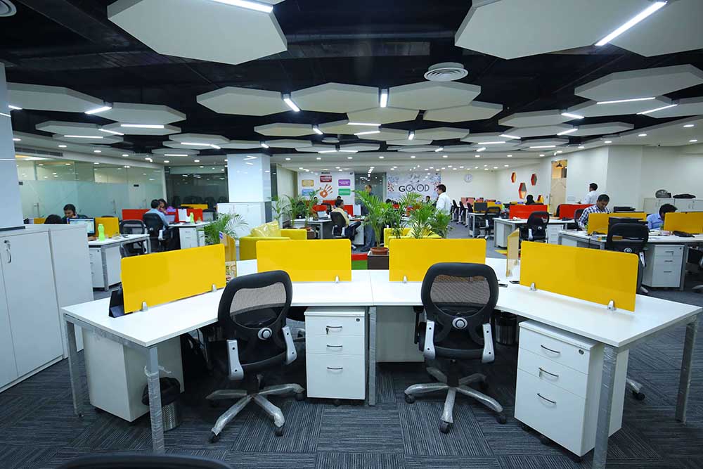
As the workplace continues to evolve, so too do the aesthetics that define modern office spaces. The year 2025 introduces a fresh wave of office design color trends that blend functionality, creativity, and sustainability. Here, we explore the most popular and impactful color palettes that are shaping offices this year, helping companies foster productivity, innovation, and well-being.
The Rise of Earth Tones in Office Design
In 2025, earth tones are taking center stage in office design. These warm, grounding hues—including terracotta, sage green, and sandy beige—create an environment of calm and connection. Designers are opting for these tones to establish a welcoming atmosphere that encourages focus and creativity.
- Why Earth Tones Matter: These shades mimic nature, offering psychological benefits like reduced stress and enhanced concentration.
- Pairing Suggestions: Combine earthy hues with natural materials such as wood, stone, and organic textiles for a cohesive aesthetic.
Biophilic Colors: Bringing the Outdoors In
Biophilic design has gained immense popularity, and biophilic colors are an integral part of this movement. Shades like forest green, sky blue, and golden sunset dominate office interiors, promoting a connection with the outdoors.
- Benefits of Biophilic Colors: These colors not only make spaces visually appealing but also improve employee well-being by mimicking natural environments.
- Integration Ideas: Use biophilic colors for accent walls, furniture upholstery, or decor pieces, paired with live plants to amplify the natural vibe.
Neutral Palettes with a Modern Twist
Neutral tones remain timeless, but 2025 introduces a modern twist to this classic approach. Think greige (a blend of gray and beige), off-white, and soft taupes.
- Why Neutrals Work: These versatile hues create a clean, uncluttered look that enhances focus and productivity.
- Adding Dimension: Incorporate textured finishes, like matte paints or patterned wallpapers, to add depth to neutral spaces.
Bold and Vibrant Accent Colors
While neutrals and earthy tones dominate, bold accent colors are being used strategically to inject energy and dynamism into office spaces. Shades like electric blue, fiery orange, and fuchsia are popular choices.
- Where to Use Bold Colors: These vibrant hues are ideal for breakout areas, brainstorming rooms, and lounge spaces where creativity thrives.
- Balancing Boldness: Pair vibrant colors with neutral backdrops to ensure they don’t overwhelm the space.
Monochromatic Schemes: Simplicity Meets Sophistication
Monochromatic color schemes are making waves in 2025. By using varying shades of a single color, designers create sophisticated and cohesive environments.
- Popular Monochromatic Choices: Blues, greens, and grays are the go-to shades for their versatility and calming effects.
- How to Execute: Mix light, medium, and dark tones within the same color family across walls, furniture, and decor.
The Return of Retro Hues
Retro-inspired color palettes are making a comeback, infusing offices with a sense of nostalgia and playfulness. Muted mustard yellows, dusty pinks, and olive greens are among the most sought-after shades.
- Why Retro Works: These colors evoke a sense of warmth and familiarity while maintaining a contemporary edge.
- Application Tips: Use retro hues in furniture or decor pieces to create a lively yet balanced aesthetic.
Sustainability-Driven Colors
Sustainability continues to influence design, with eco-friendly color trends reflecting the movement. Shades like moss green, ocean blue, and clay red are inspired by the natural world.
- Eco-Friendly Appeal: These colors often pair with sustainable materials, further emphasizing a commitment to environmental consciousness.
- Design Tips: Opt for low-VOC (volatile organic compound) paints to ensure both visual appeal and a healthier workspace.
Technology-Inspired Metallics
Metallic tones are gaining traction in tech-focused office spaces, creating a sense of modernity and innovation. Silver, gold, and bronze accents are being used sparingly to elevate designs.
- Why Metallics Shine: These hues reflect light and add a touch of luxury to workspaces.
- Best Practices: Use metallics in lighting fixtures, hardware, or wall art to avoid overpowering the overall design.
Color Psychology in Office Design
Understanding color psychology in office interior design is key to creating a productive and harmonious workspace. Each color evokes specific emotions and behaviors:
- Blue: Encourages calmness and focus, ideal for conference rooms.
- Green: Promotes balance and creativity, perfect for collaborative spaces.
- Yellow: Inspires optimism and energy, suitable for breakout areas.
- Gray: Conveys professionalism and neutrality, fitting for private offices.
Incorporating 2025 Trends in Your Office
Adopting 2025’s office design color trends doesn’t require a complete overhaul. Here are a few practical tips to integrate these hues seamlessly:
- Start Small: Experiment with accent walls, cushions, or artwork.
- Blend Styles: Mix trending colors with existing decor to maintain cohesion.
- Consult Professionals: Work with interior designers to create a balanced and personalized color scheme.
Office design in 2025 is all about creating spaces that are not only visually stunning but also conducive to productivity and well-being. By leveraging these color trends, companies can craft environments that inspire and motivate their teams.
