The interior design of an office is more than just an aesthetic choice—it is a strategic decision that directly influences the productivity, creativity, and well-being of employees. Color psychology plays a pivotal role in crafting environments that not only look appealing but also foster a positive and efficient work culture. By understanding the emotional and psychological effects of colors, organizations can create office interiors that enhance focus, reduce stress, and encourage collaboration.
Understanding the Impact of Colors on Human Psychology
Colors have profound effects on the human brain and can evoke a spectrum of emotional responses. The right color palette can transform an ordinary office space into an inspiring environment. Here’s how different colors impact workplace behavior:
- Blue: Known for promoting calmness and concentration, blue hues are ideal for environments where focus and productivity are crucial. Lighter shades of blue can make a space feel more expansive and serene, while deeper blues instill a sense of trust and stability.
- Green: Symbolizing nature and balance, green tones reduce anxiety and stress. Offices that integrate green through walls, furniture, or plants can create a refreshing and relaxing atmosphere, promoting creativity and innovation.
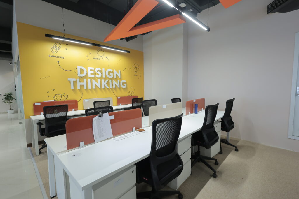
- Yellow: As the color of energy and optimism, yellow stimulates mental activity and enthusiasm. It is ideal for creative spaces but should be used cautiously, as overly bright yellows can cause anxiety.
- Red: This powerful color evokes passion and excitement. Red is best used in areas where high energy and physical activity are prevalent. However, excessive use can be overwhelming and lead to feelings of stress.
- Neutral Colors (White, Gray, Beige): These colors offer a versatile backdrop that allows for the introduction of bolder accent colors. They promote clarity and cleanliness, though an overuse may lead to a sterile or uninspiring environment.
Strategic Use of Colors in Different Office Areas
Selecting the right colors for an office is essential for creating a productive and inspiring work environment. However, certain mistakes—such as using overly bright shades, ignoring lighting effects, or neglecting brand identity—can negatively impact the workspace. The following are common mistakes to avoid in office color design.
Reception Areas
The reception area is the first impression of a company. Warm, welcoming colors like soft oranges or neutral tones can make guests feel comfortable and valued. Incorporating subtle blues or greens can also convey professionalism and trust.
Workstations
For areas dedicated to focused tasks, calming colors like blues and greens are ideal. These hues help maintain concentration and reduce fatigue. Incorporating adjustable lighting can complement these colors, enhancing comfort and productivity.
Meeting Rooms
Spaces designed for collaboration and idea generation benefit from stimulating colors. Yellows and light oranges encourage enthusiasm and creativity. However, to balance the energy, these colors can be combined with neutral tones that prevent overstimulation.
Break Rooms and Lounges
These spaces should promote relaxation and stress relief. Soft greens, earthy browns, and warm beige tones can create a cozy atmosphere, encouraging employees to unwind and recharge.
Private Offices
Private workspaces require a balance of focus and creativity. Soft blues, combined with wooden textures and green plants, foster a calm yet inspiring environment. Customizing color schemes based on personal preferences can further enhance comfort and productivity.
Incorporating Biophilic Design with Color Psychology
Biophilic design integrates natural elements into interior spaces, enhancing well-being and productivity. Utilizing colors that mimic natural landscapes—like sky blues, forest greens, and earthy browns—can deepen the connection with nature. This approach not only improves mood but also reduces stress and enhances creativity.
Adding indoor plants, natural wood textures, and water features can complement color choices, creating a holistic and rejuvenating workspace.
The Role of Lighting in Enhancing Color Effects
Lighting significantly influences how colors are perceived. Natural light enhances the true tone of colors, making spaces feel open and vibrant. Conversely, artificial lighting can alter color perceptions. Warm lighting complements earthy and neutral tones, while cool lighting enhances blues and greens.
Using adjustable lighting solutions allows for flexibility in mood and ambiance, ensuring that the chosen color palette achieves its intended psychological effect.
Common Mistakes to Avoid in Office Color Design
Effective office color design enhances productivity, mood, and brand identity. However, poor color choices can lead to an unbalanced and uninspiring workspace. The following are common mistakes to avoid in office color design.
- Overusing Bold Colors: While accent walls in vibrant colors can add character, excessive use can be overwhelming and distracting.
- Ignoring Cultural Preferences: Different cultures perceive colors uniquely. Understanding cultural connotations ensures the design is universally welcoming.
- Neglecting Brand Identity: Colors should reflect the brand’s ethos and identity. Integrating brand colors into the interior design strengthens corporate identity and cohesion.
Conclusion
The thoughtful application of color psychology in office interiors is a powerful tool for enhancing productivity, well-being, and brand perception. Office interior designers in Gurgaon specialize in selecting the right colors for different office zones and complementing them with appropriate lighting and design elements. By leveraging their expertise, organizations can create spaces that inspire, motivate, and comfort.